Director's Corner
18 May 2006

Barry Barish
New Look and New Logo
Today we inaugurate a new look for the ILC website, as well as a new logo. We have strived to make our website as functional as possible, while also making it attractive. The site is still a work in progress, and we are yet to institute some of the most important features that will be incorporated soon, such as a complete Electronic Data Management System (EDMS). Xeno Media, our web designer from the very beginning, developed our new look, and we thank them for their continued efforts to make our website attractive and functional.
In addition, today we introduce our new logo. Sandbox Studio created the logo, which will now appear on our slides, stationary, business cards and other documents representing the ILC. Again, our thanks to Sandbox, and also to our GDE communications team for converging on this new look and logo design.

It is interesting to reflect on the history and importance of logos, which have become so common and so much a part of today’s world. Although some sort of graphic symbols have been used for centuries to represent various identifiable entities, the modern logotype only traces back to the 19th century. A byproduct of industrialization, the logo emerged in the 19th century as a result of a combination of high illiteracy rates and the manufacturers’ need to find a way to identify their products, both in terms of the content of their packages, and as importantly, to distinguish themselves from competing products. As a result, graphical representation became an important means to label items for sale.
This idea of graphical representation has spread to become a part of modern science. Our major laboratories and institutions all are commonly referred to and recognized from their acronyms, for example the major HEP and ILC laboratories – KEK, DESY, CERN, FNAL and SLAC. In addition, they all have logos that represent their laboratory and their science.
 <
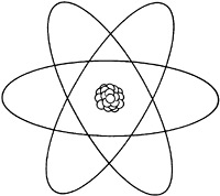
<Perhaps the most familiar science icon or logo for our field is the famous nucleus with orbiting electrons. This elegant little graphic represents Rutherford’s planetary model of the atom, which was improved by Neils Bohr in 1913, when he was proposing fixed orbits, or energy levels for the electron traveling around the nucleus. This planetary model of the atom is usually called the Rutherford-Bohr model, and it has been graphically represented by this familiar icon and logo.
Of course, despite its graphic simplicity and the highly recognizable image, the real orbit of an electron is indeterminate and not well described by this simple and elegant graphic.
-- Barry Barish